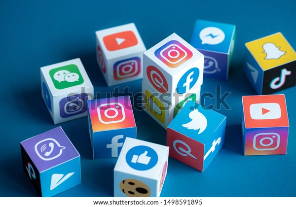
Over the years, technology has progressed and impacted the world greatly. With the advancement of technology, there have been an array of tools and other applications that have that have been made available to anyone with access to an electronic device. This has also enhanced the growth of web designing and its presentation. Some of the most popular applications available to the world that are use daily include Facebook, Instagram, and even blogs on various of topics. To attract more people to a certain webpage or application, the website designer must undergo a process. A website designer should always keep in mind the audience they are trying to reach and the reasoning behind the business they are designing for. To catch the eye of the audience, one must bear in mind that every detail matters. For instance, the color scheme, the font, and the text size of the wording are all very important details to take into account.
While learning about designing a website one important factor to keep in mind is that it involves a variety of steps. In art class one learns about primary colors, secondary colors, and accent colors. Keeping in mind how important color coordination is, every specific website design has a specific color palette. Just like certain words evoke emotions, so do colors. Wix Blog (2017) described how certain colors evoke certain feelings when seen. For instance, when one sees the color blue, they associate it with the sky or oceanic water and most feelings are positive or warm. In the website realm blue represents trustworthiness, dependable, and professionalism. Green can be associated with soft grass or the leaves on a tree during spring. In the website realm it represents peacefulness, balance, and growth. When one talks about the color yellow, it automatically sends warmth throughout one’s body because it reminds one of the beautiful sun that shines down on us. Yellow, according to Wix Blog (2017), represents happiness and optimism. The aforementioned colors (primary, secondary, and accent) are important to bear in mind when designing a website. Accent colors are bold and tend to draw the audiences’ eyes to a specific element on the webpage. The rule of 60-30-10, was new information to me. This rule is used for guidance when developing a website. This rule is broken down by the following, 60% is the websites primary color, 30% is the websites secondary color and the final 10% comes from the websites accent colors (Wix Blog, 2017).
Another key element in developing a website is the text size and the font. Keeping in mind the intended audience, you want the words to be readable and understandable. This will allow the audience to stay focused and intrigued on the presenting information. With the intention of a specific audience, some steps that help keep them engaged are to strategize your brand, approach the design, prioritize usability, prepare for search engines, and go mobile (Wix Blog, 2020).
When it comes to designing a website there are meticulous elements that are vital to the website. Some of these meticulous elements are the choosing of colors, a layout, fonts, branding, and the targeting audience. While I know these are important to remember, I still would like to further research the variety of other tools out there to help design an exemplary website. I can attend conferences, research for further articles, and even collaborate with my colleagues.
Reference:
Wix Blog. (2017). How to choose the perfect color palette for your business. noCodeBA.
https://www.wix.com/blog/2017/10/how-to-choose-the-perfect-color-palette-for-your-business/
Wix Blog. (2020). Step-by-Step Guide: How to Create the Ultimate Professional Website.Wix Blog. https://www.wix.com/blog/2016/06/how-to-create-website-step-by-step-guide/
photo link https://image.shutterstock.com/image-vector/modern-colorful-flow-poster-wave-600w-1017305410.jpg


